Item Tooltips
The Inventory System supports flexible tooltip implementations by allowing any widget to display item information using the same Item ViewModel. This approach ensures that tooltips reflect the same live data used by item widgets, with no additional binding work.
Tooltip Options
You can implement item tooltips in a few different ways, depending on your design:
Native Tooltips: Using the
Set Tool Tipwidget property available in Unreal.Floating Tooltip Widget: A dynamically spawned widget that follows the cursor or appears near the hovered item.
Static Panel: A fixed section of the screen (e.g., side panel or status box) that updates based on hover/focus state.
Mouse Cursor Override: Embedding the tooltip inside a custom mouse cursor or UI element.
No matter the strategy, the key is transferring the Item ViewModel from the hovered item to the tooltip widget.
ViewModel Binding
When creating your Tooltip Widget:
Add an Inventory Item ViewModel.
Set its Creation Type to
Manual, since the instance will be passed in externally.Add additional fragment ViewModels (e.g. Stack, Quality) using
Resolverand theInventory Resolverclass.
This matches the setup of a standard item widget, except that the primary data is injected from the outside.
Showing the Tooltip
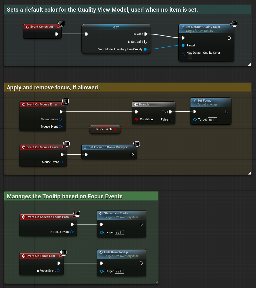
In most cases, the tooltip should be shown when the item widget receives focus, which commonly happens when the user hovers over or navigates between widgets using the pre-defined navigation.
Handling Focus and Mouse Events
In your Item Widget's Event Graph, handle On Mouse Enter and On Mouse Leave to control focus.

Use
On Added to Focus PathandOn Focus Lostto show and hide the tooltip respectively.
Creating the Tooltip Widget
Use
Create Widgetto spawn your tooltip. Assign the class and owning player.Retrieve the MVVM View from the created widget using
Get View from User Widget.Use
Set ViewModel by Classto assign the Item ViewModel from your current item to the tooltip.
Hiding the Tooltip
To remove the tooltip when focus is lost:
Removing the Tooltip Widget
Check if the Tooltip Widget is valid. If so, call
Remove from Parent.Clear the reference to avoid holding stale widget pointers.

Summary
Tooltips are an extension of the same data flow used by item widgets. By reusing the Item ViewModel, you guarantee that tooltip content remains in sync with the live state of the item.
The MVVM setup makes it easy to:
Maintain a single data source across UI elements.
Build reusable tooltip widgets that automatically respond to bound values.
Support all input types using the same focus and hover event logic.
You can combine this approach with UMG or CommonUI, and the tooltip will behave consistently as long as the ViewModel flow is respected.